POST CATEGORIES
September 20, 2018
Starting from an already clean design, how did RealDecoy improve the user experience on CCRCanada.com? By giving users what they’re looking for.
By Bruce Hillcoat
When is a clean design not enough?
If you had taken a quick look at the company’s previous site, you might wonder why Canada Clean Room—or CCR, for short—would be interested in a total rework of their website.
You would have been presented a clean, simple, straightforward web journey, as this April 2018 link on archive.org reveals.
So why change?
Let’s start by looking at what’s in your pocket.
Mobile responsiveness was an initial catalyst
The mobile experience on ccrcanada.com was—and is—a high priority for Canada Clean Room management. When the decision to improve CCR’s overall user experience was made, here’s what the mobile version of the home page looked like:

CCR's previous mobile site home page was difficult to view and navigate.
Picture opening what you see above and navigating it on your mobile device. Looks a bit tricky, doesn’t it? All those tiny icons representing different products.
Also at that time, the site’s responsiveness—its ability to respond to the visitor’s screen size, and automatically adapt to desktops, laptops, tablets or mobile phones—simply wasn’t cutting it.
Here’s an example:
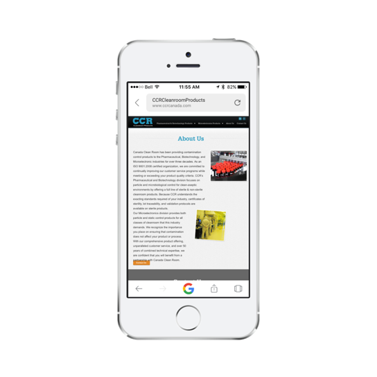
Canada Clean Room's old mobile experience had responsiveness issues.
See how the text was crashing into the Contact Us call-to-action button at the bottom of the screen? Not good.
To make experiences smooth, remove the friction
When you want to convey quality and deliver a frictionless experience for users, web responsiveness is a critical UX issue.
This recognition is increasingly common for many companies, especially as mobile device web browsing becomes the norm.
Have you tried navigating your own site on a mobile device lately? If it’s not smooth and intuitive, you should look into fixing it.
But let’s get back to what Canada Clean Room wanted to achieve.
And we’ll do that by showing you where they—and we—have arrived. First, a new perspective from the desktop:
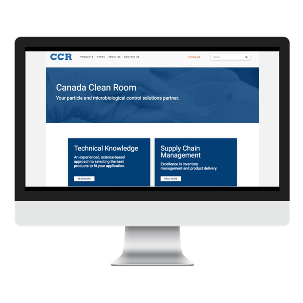
The new Canada Clean Room home page is now clean and clear.
So, as a first impression, does that say “clean” to you?
Clean design. Clean and clear value proposition. Clean and clear navigation.
A fitting user experience for a company called Canada Clean Room, yes?
Comparing apples to apples
And, to compare what you’ve already been shown, how does the old mobile experience stack up to the new one?
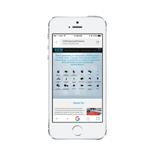
CCR’s old site: cramped and unclear
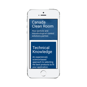
CCR’s new site: free and clear
Which screen communicates more clearly to you?
Now let’s take a step back and look at what was changed, and why.
What’s in your value proposition?
The most important element in your online presence is your value proposition.
Why?
Your value proposition tells site visitors who you are and what they’ll get when they engage with your site.
A strong value proposition offers relevance: Does what you say when visitors arrive on your site align with what they’re looking for?
And a strong value proposition offers resonance: Does what you say connect with visitors? Does it speak to them, meshing with their beliefs and aspirations, their needs and desires?
If you fail to deliver a clear and compelling value proposition when a visitor first arrives, that’s the biggest reason a user will hit the back button and bounce off your site. Even if the content elsewhere on the site is perfectly suited to their needs, many visitors won’t bother continuing if you don’t speak to what they want right away.
We worked with Canada Clean Room executives to crystallize their value proposition. And we, of course, recommended it appear right up front.
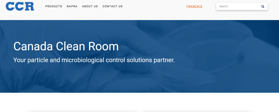
Canada Clean Room's new value proposition concisely conveys what the company offers.
The value of 3-Q
To arrive at this value proposition, we engaged CCR team members and, along with members of our team, participated in what we at RealDecoy call a 3-Q workshop.
The idea behind 3-Q is that to arrive at Quality results, it’s best to approach the challenge through both Quantitative and Qualitative efforts.
As a collaborative process that leverages the expertise of cross-functional teams over a short, concentrated period, 3-Q combines both evidence (often through data analytics and research) and insight in order to drive results.
Further refining what CCR offers
The 3-Q process also revealed that technical knowledge and supply chain management were integral parts of what customers wanted. More importantly, these capabilities were key differentiators of Canada Clean Room’s offering.
It made perfect sense to highlight these prominently beneath the main value proposition.

It's important to highlight main competitive advantages. Canada Clean Room now clearly presents its main differentiators.
Conveying greater value in product offerings.
Prior to embarking on a discovery session, and before the 3-Q workshop, here’s how Canada Clean Room presented itself, and its products, on the CCR home page:
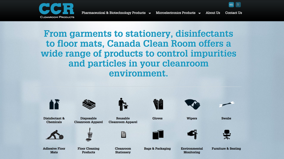
Canada Clean Room's old homepage did not fully convey the company's differentiators, nor the added value customers received.
While a casual observer might feel this earlier value proposition and the accompanying icons presented an immediate, easy-to-grasp sense of what Canada Clean Room offers, it did not take long for CCR executives to agree that the company’s earlier presentation and positioning did a disservice to the Canada Clean Room brand.
It suggested the company was simply an online provider of what appeared to be commodity cleanroom products. Lacking in this proposition was any sense of expertise, experience, or added value.
By meeting with CCR and determining what the company’s differentiators are, and how customers wants and needs played into these differentiators, a more targeted value proposition and improved UX naturally emerged.
Here is how clearly and cleanly visitors to CCR’s site can now access products:

Better User Interface (UI) design means making the user's experience smooth and frictionless.
And below is a glimpse into how these products are further categorized.
Rather than presenting a bunch of small icons that require users to hunt for a specific product, CCR’s new User Interface (UI) provides headings reflecting more comprehensive, intuitive categories.
Note, as well, the new microcopy below each heading. Instructive, helpful text that’s easy to digest.
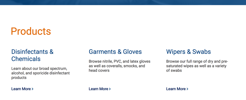
Clear, comprehensive headings and helpful microcopy are UI design choices that make for a better UX.
Are you arriving at the same clean conclusion we did?
We could go on about how we helped take Canada Clean Room to a higher, cleaner level of UI design that delivers a better UX.
For example, look again at the long and heavy “About Us” copy in the old mobile version presented near the beginning of this article. We greatly shortened and broke up uninviting and intimidating blocks of text. Have a look at ccrcanada.com and see for yourself.
But, in wanting to wrap things up, what’s the conclusion here? Here are three quick takeaways:
- Even if your current site seems clean and clear, it could probably benefit from closer scrutiny. Like Canada Clean Room’s executives, you may want to move beyond “it’s fine” to “are we doing all we can?” when assessing the strength and value of your online presence.
- Start by truly discovering (with an objective viewpoint from outside help, ideally) what makes your company different, and how that aligns with what customers want and need. From there, define and refine your value proposition.
- Make smart UI design choices to improve your UX. Make your User Experience smooth and frictionless. Fully integrate copy and design. Make what you say as cohesive and compelling as how you present your company and its offerings.
Sure, there’s more to it than this oversimplification. But this conclusion does what Canada Clean Room does:
Think clean.
Related Articles
Dot Foods rides the cutting edge of the food service industry
Read how a phased approach to implementation helped Dot Foods manage its budget, time, and people more effectively.
Read MoreRealDecoy brings clarity to Verizon’s Professional Services
Learn how Verizon collaborated with RealDecoy to leverage Oracle EID for demand and capacity management.
Read MoreFunding the Future at Carleton
A successful crowdfunding platform that allows donors both within and outside the university to connect and support Carleton U.
Read More

